Image Optimization Workflow: Responsive AVIF/WebP with Lazy Loading
Most teams treat images like stuffing for a page. Compress some JPEGs, call it a day, and hope Lighthouse smiles. Then a hero swap happens, speed tanks, and everyone scrambles. I’ve lived that escalation path. Not because people are careless, but because the pipeline had no guardrails.
If you want faster pages, you don’t start with spreadsheets of “image best practices.” You start with the user’s first paint and work backward. LCP safe. CLS quiet. Formats that negotiate cleanly. Caching that never guesses. And a workflow that makes the right thing the default, even when marketing is moving fast.
Key Takeaways:
- Prioritize LCP safety: fetchpriority for the hero, explicit dimensions, correct formats
- Contract build-time outputs with edge-time delivery: filenames, widths, Accept-aware caching
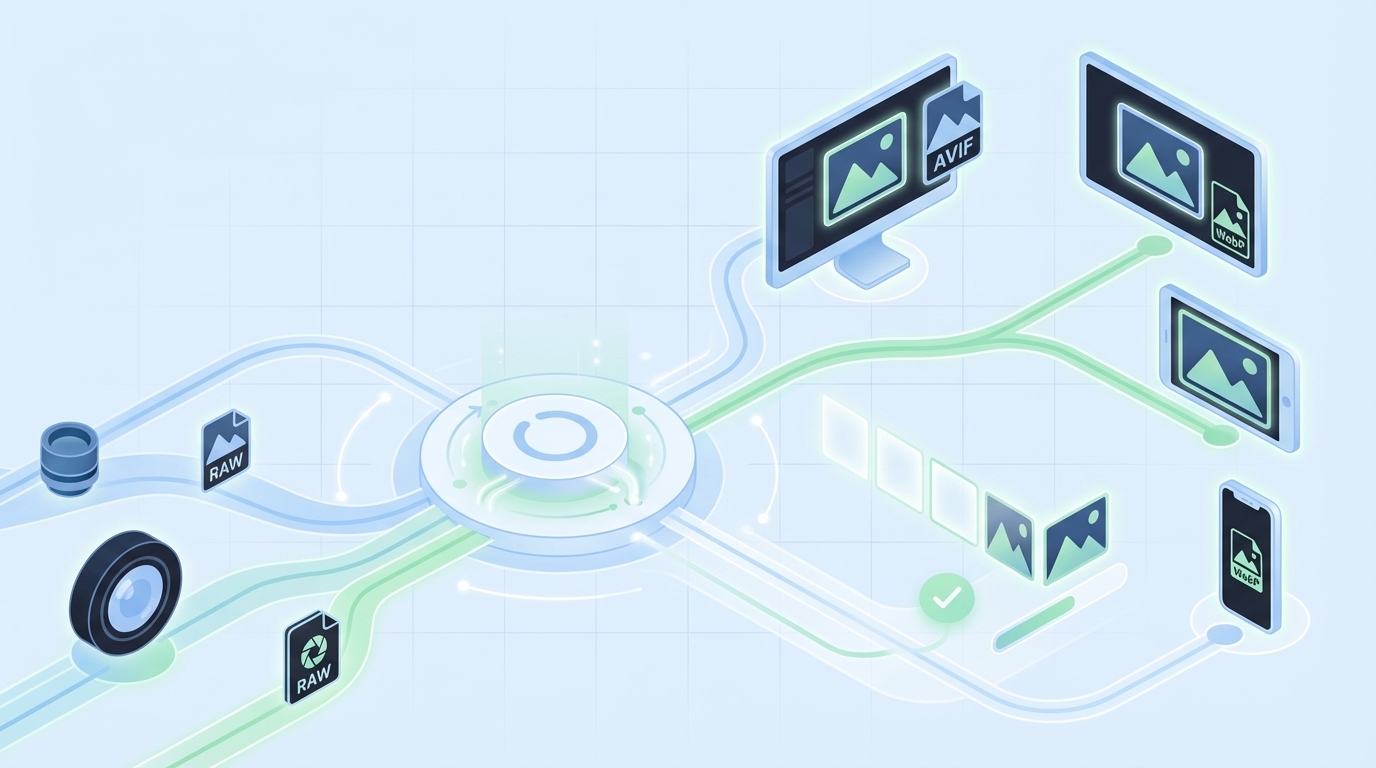
- Use AVIF first, WebP fallback, then JPEG/PNG as a resilient baseline via the picture element
- Generate predictable responsive variants and stable filenames to avoid cache pollution
- Lazy-load below-the-fold with LQIP; never lazy-load the LCP image
- Use a governed system to reduce rework: consistent alt text, filenames, placement, schema
Why Your Image Pipeline Still Bloats Pages
Most sites bloat pages because the image pipeline doesn’t protect LCP and CLS. You ship whatever the CMS exports, squeeze it a bit, and hope the CDN saves you. It rarely does. The fix is a predictable format chain, dimension discipline, and cache-aware delivery that privileges the hero image first.
The Metrics That Actually Matter For Images
If you care about users, you care about LCP first. Get the hero image stable, correctly sized, and requested early. CLS stays under 0.1 when you reserve space with width and height. And input responsiveness holds up when you don’t block the main thread with heavy decode. Fancy totals don’t matter if the first interaction feels slow.
Here’s the nuance. Mobile networks are the real test. LCP at 2.5s on a clean desktop means very little if your median user is on congested 4G. You need fetchpriority on the hero, a preload for the final URL, and a decoder strategy that doesn’t stall input. Everything else can trail without hurting perceived speed. That’s the mental model.
When you build to protect these outcomes, decisions get simpler. Which formats? The ones that reduce hero bytes without breaking SEO or accessibility. Which attributes? The ones that prevent layout jump and allow the browser to choose the smallest correct asset. It’s not dogma. It’s priorities in production.
What Most Teams Miss Between CMS And CDN
The expensive mistake isn’t a single heavy file. It’s a broken relationship between the CMS output and the CDN’s delivery rules. If the CMS ships a single JPEG and your CDN tries to “optimize” on the fly without stable keys, you get cache fragmentation and inconsistent wins. Sometimes AVIF lands. Sometimes a fat JPEG leaks through. Multiply by pages and you’re paying for chaos.
You need a contract. Predictable variant names, width markers, and a format ladder exposed to the edge. If the CDN keys on Accept headers and width (or a standardized w= parameter), it can serve the right bytes on repeat. Without that, the cache can’t help you. For a practical walkthrough of format negotiation in markup, see this overview of using the picture element for AVIF and WebP with fallbacks from Contentful’s HTML pattern.
The team that owns the CMS often assumes “the CDN will handle it.” The CDN team assumes “the CMS generated what we need.” When both sides assume, users wait. Close the loop. Write the contract down in filenames and cache keys.
What Is The Right Format Mix Today?
Start with AVIF for photographic content. It typically delivers the best compression at acceptable quality. Offer WebP as a reliable fallback. Keep optimized JPEG or PNG as your baseline for long-tail browsers, and preserve progressive JPEG where it makes sense. Screenshots, UI, and sharp-edged graphics often compress better in WebP than AVIF—test and keep both ladders available.
The picture element is your friend because it gives the browser choices while you maintain accessibility. AVIF source first, WebP next, then an img with JPEG/PNG. Keep descriptive alt text, explicit dimensions, and don’t bury the hero behind lazy-loading. None of this is “pure.” It’s pragmatic. Formats evolve; fallbacks keep you safe.
One more detail teams skip: decoding hints. Non-critical images can use decoding=async to avoid blocking. Critical images should be eligible for early decode, but only after you’ve ensured the file isn’t oversized for the slot. Purpose first. Then bytes.
The Real Bottleneck Lives Between Build And Delivery
The real bottleneck isn’t your compressor; it’s the missing contract between build outputs and edge behavior. If the build emits variants that the CDN can’t deterministically select and cache, you’ll ship the wrong bytes. Lock in filenames, widths, and Accept-aware caching so the edge can do its job consistently.
Why Build-Time And Edge-Time Need A Contract
Build systems are great at generating variants: widths, densities, and format ladders. CDNs are great at placing those bytes close to users. But unless the CDN can key on what matters—Accept header for format, width signals for size—you’ll serve the wrong file to a subset of users and poison the cache for the rest.
Write the contract in the only places that count: filenames and cache keys. For example, standardize width tokens (w320, w480, w768, etc.) and include format extensions (.avif, .webp, .jpg). Configure your CDN to vary on Accept and width or a canonical w parameter. When those pieces align, prewarming and cache hit rates improve, and LCP gets boringly consistent. That’s the goal.
I’ve seen teams invest weeks in compression audits and win back less than 100ms because their edge couldn’t reliably pick the right asset. Meanwhile, a simple naming and keying change shaved 400ms off LCP at scale. It’s not glamorous. It works.
What Traditional “Compress Images” Advice Gets Wrong
Compression without context feels productive and usually isn’t. If your markup doesn’t express real breakpoints through sizes and srcset, browsers play it safe and download oversized assets. If your hero lacks fetchpriority=high and a proper preload for its final URL, it’s going to wait behind CSS and JavaScript it shouldn’t.
Also, density matters. Modern devices need 2x assets in some viewports, but not all. Generate rational width sets and pair them with truthful sizes attributes so the browser chooses correctly. If you’re working in a framework, the core ideas are the same even if syntax differs. This guide to image optimization patterns in modern frameworks explains how building responsive variants, setting dimensions, and negotiating formats work together in practice: see the Next.js Image Optimization overview.
Want to see how a governed system pairs with your build and edge rather than guessing at runtime? If that’s interesting, you can Try Using An Autonomous Content Engine For Always-On Publishing and stress fewer details by hand.
The Hidden Costs That Compound With Every Unoptimized Image
Unoptimized images don’t just waste bandwidth; they quietly tax speed, conversions, and team time. Even a small LCP slip on mobile moves bounce rates. Add rework from CLS issues and broken fallbacks, and the costs stack up. You don’t need perfection. You need a system that avoids common misses by default.
Let’s Pretend You Ship 1 MB Extra Per Page
Let’s keep it simple. Say you ship an extra 1 MB per page. At 100k monthly pageviews, that’s 100 GB of avoidable transfer. On mobile, that extra second or two pushes more people to back out. You won’t see a dramatic cliff—just a steady, frustrating leak in conversions.
Now move to team cost. Support tickets about “site feels slow.” A Slack thread about layout jump when someone uploaded a tall hero. A quick “can you fix it?” that eats an afternoon. None of this is catastrophic in isolation. But it compounds. And when you finally audit, you find a dozen near-misses that a consistent pipeline would’ve prevented.
Revenue impact is real, even if it’s not dramatic on a single page. Miss 0.5% conversion on a high-intent page at scale and it stings. The cure isn’t heroics. It’s predictability.
The Cascading Impact On SEO And Accessibility
Search systems consider LCP and stability signals. If your hero arrives late or your layout jumps because width and height were missing, you’re nudging ranking signals the wrong way. That’s not fear mongering—it’s just how the ecosystem evaluates user experience today.
Accessibility amplifies this. Vague alt text or none at all hurts real humans and weakens your semantic signals. The fix is unglamorous and consistent: explicit dimensions to prevent CLS, descriptive alt that reflects the image’s purpose, and a fallback chain that doesn’t break when a format isn’t supported. Tools can help you compress; they can’t recover meaning you didn’t provide. For a high-level look at how teams think about these basics, reviews of popular tooling like Imagify explain tradeoffs and pitfalls—see this overview of compression and workflow considerations.
Treat SEO and accessibility as the guardrails that keep performance wins honest. They’re not separate projects. They’re part of the same system.
What It Feels Like When Images Break Performance And SEO
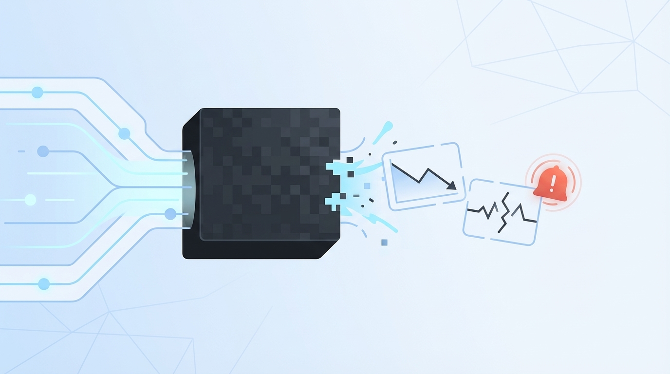
When images fail, it rarely looks dramatic in dev. It fails in production: a heavy PNG sneaks in, CLS spikes, and the bounce rate climbs while no one’s watching. The 3am Slack ping isn’t about blame. It’s a pipeline without constraints, and it surfaces at the worst time.
The 3am Incident No One Saw Coming
We’ve all had some version of this. A new hero drops for a campaign. It’s gorgeous. It’s also a 3,000px PNG without dimensions. On publish, the layout jumps, the hero decodes late, and the top nav flickers. By the time you wake up, someone’s posted a screenshot and tagged five people with “hotfix now.”
Here’s the hard truth. It’s not the uploader’s fault. The system allowed a fragile asset into a fragile slot. No enforced dimensions. No format contract. No fetchpriority. No preload for the final URL. You can roll it back, but that’s a bandage. The fix is a repeatable pipeline that makes the safe thing the default.
I’ve had to explain this in exec reviews. It’s never fun. But once folks see it’s structural, not personal, you get permission to fix the structure.
How Do You Keep LCP Safe When Lazy-Loading?
Don’t lazy-load the LCP image. Mark it eager, add fetchpriority=high, and set explicit width and height. Everything below the fold can get loading=lazy. Mask the delay with a low-quality placeholder (LQIP) or a dominant color so the page feels responsive. Then test the whole flow in mobile conditions, not your office Wi‑Fi.
The next detail is negotiation. Serve the smallest correct variant and let the browser pick via srcset and sizes. Reserve space so the layout doesn’t jump when the asset swaps. If you’re working with component libraries, make these settings defaults so devs and authors don’t reinvent the wheel on every PR. For more implementation patterns in modern stacks, this practical overview of React image optimization tradeoffs is helpful context.
Protect the hero. Make everything else lazy by default. That combo keeps LCP predictable and keeps your team out of late-night fire drills.
A Production Workflow That Ships Fast Images Without Surprises
A stable image workflow combines a resilient format ladder, predictable variants, honest markup, and disciplined lazy-loading. Do those four things and performance becomes routine. You’ll still tune edges, but the big wins lock in. Aim for boringly fast.
Choose Formats And Fallbacks That Never Fail
Start with a picture element. Provide AVIF first, WebP second, and a baseline JPEG/PNG img as the final fallback. Keep descriptive alt text that reflects intent, not just file names. Set width and height to reserve space and apply decoding=async on non-critical images to avoid blocking rendering.
Make this a reusable component in your design system. Not a snippet in a wiki. A real component. That way, authors can swap images without breaking structure, and engineers don’t hand-review every change. The point isn’t purity—it’s resilience when the real world shows up.
One interjection. Keep long-tail browsers in mind. Progressive JPEG still matters in some contexts. Pragmatism wins.
Generate Responsive Variants At Build Time With Predictable Names
For each source image, generate a rational set of widths: 320, 480, 640, 768, 1024, 1440, and 2x where density matters. Use a naming convention like name.w640.avif, name.w640.webp, name.w640.jpg so the edge can key correctly without guessing. Emit a manifest your templates can read, and keep it in CI so drift is visible during review.
Tooling is flexible here. sharp, Squoosh CLI, or your favorite pipeline can do the job. The critical piece isn’t the tool. It’s the contract: predictable names, included widths, and a single source of truth. If the file exists in build, the edge should find it without thinking. For a primer on thinking through image optimization tactics at a practical level, this overview on optimizing web images is a useful baseline.
The outcome you want: fewer surprises, higher cache hit rates, and a clear path to prewarming critical assets.
Author Robust Markup And Negotiate Formats At The Edge
Let the browser pick with srcset and sizes. Keep sizes honest so you don’t force oversized downloads. On the edge, vary cache keys by Accept and width (or a canonical w parameter). If you must transform on the fly, make the transformation deterministic and cacheable with predictable keys. Avoid opaque URLs that can’t be prewarmed or reasoned about.
Markup rules are boring for a reason. They’re how you prevent backsliding when the content team moves quickly. When authors can’t accidentally ship fragile markup, your ops team sleeps better.
Remember: you’re not chasing perfection. You’re removing foot-guns.
Lazy-Load Below-The-Fold With LQIP While Protecting The Hero
The hero gets fetchpriority=high and loading=eager. Everything else can lazy-load with IntersectionObserver as a progressive enhancement. Use a tiny blurred placeholder or a dominant color so the transition feels intentional. Most importantly, preload the hero’s final URL so you don’t fetch a placeholder and the real asset back-to-back.
When you treat the fold as the boundary for behavior, you make the browser’s job easier. That’s what reduces jitter and “feels slow” complaints. Users don’t care about your tooling. They notice when the hero doesn’t pop.
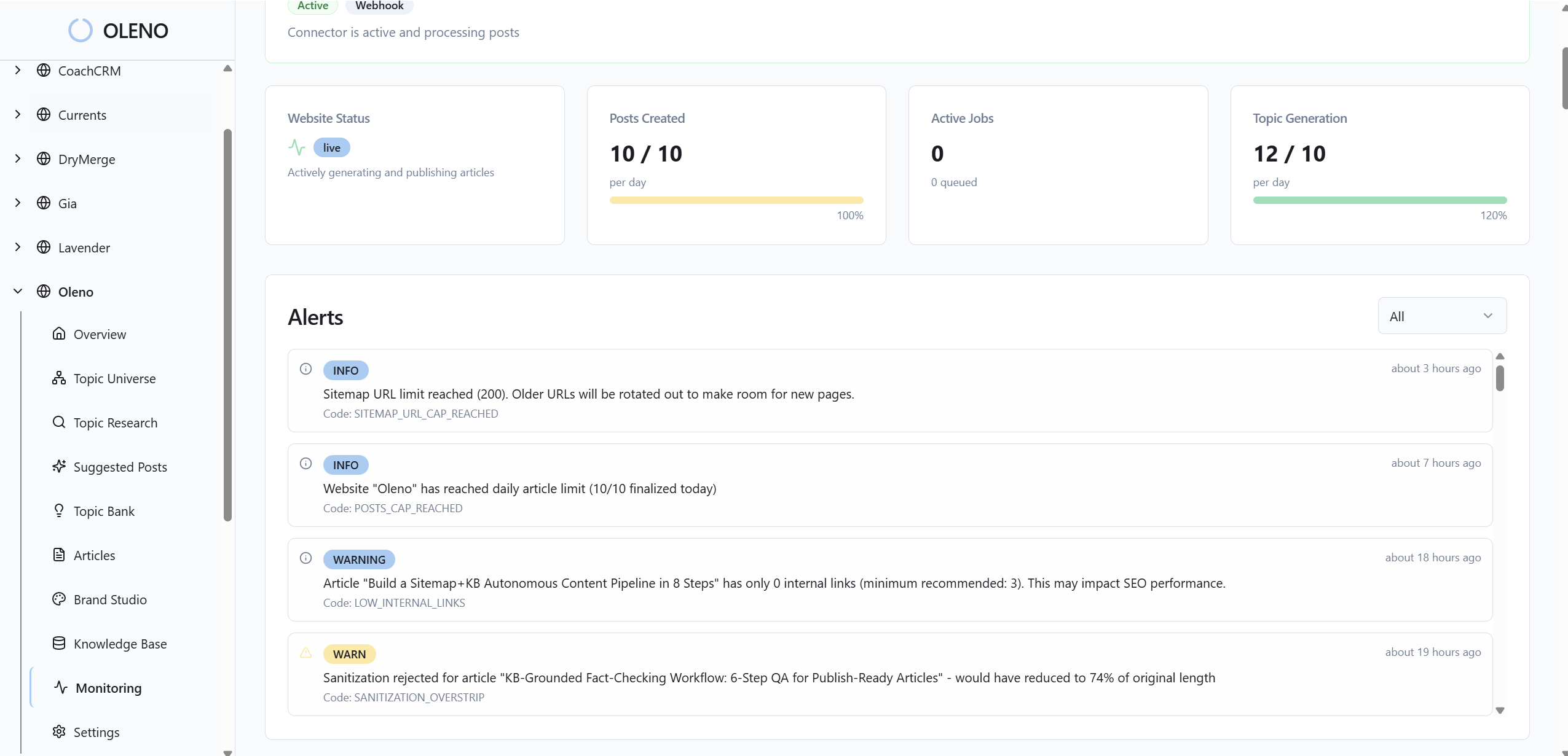
How Oleno Fits Into Your Image Workflow Without Breaking Your Stack
Oleno doesn’t replace your build or CDN; it feeds them clean inputs. Visuals are on-brand with stable filenames and alt text. Markup is structured for clarity. QA guards against common misses. Your CI and edge enforce budgets and delivery. It’s cooperation, not control.
How Visual Studio Enforces Consistency For Images
Oleno’s Visual Studio generates on-brand hero and inline visuals, assigns SEO-friendly filenames, and produces alt text automatically. That reduces the odds of generic or misnamed images slipping into production. It also means when you request a product screenshot for a solution section, you get the right asset in the right place, without a Slack thread and a design queue.
You still own formats and bytes. Keep your AVIF/WebP/JPEG ladder and responsive variants in your build. Oleno keeps the content layer predictable—what the image is, where it goes, and how it’s described—so your delivery pipeline can operate with fewer surprises and fewer regressions.
This separation of concerns matters. Content and structure are governed upstream. Delivery is governed at build and the edge. Less finger-pointing. More repeatability.
How Publishing Pipeline Preserves Filenames And Placement
Filenames need to be stable for caches to stay hot. Oleno’s publishing connectors map fields to your CMS, embed visuals and metadata correctly, and prevent duplicate publishing. The filenames you plan for at build are the filenames that ship. No silent renames. No broken manifests.
Placement rules keep product visuals in the right sections. That predictability helps you keep the LCP image consistent on critical pages. If the hero always lands in the same slot, your preload and fetchpriority patterns stay valid across releases. That’s how operational discipline shows up in user experience.
Again, this isn’t about perfection. It’s about reducing avoidable churn.
How QA Gates Reduce Rendering And CLS Risks
Oleno enforces a pre-publish QA pass that checks structure, tone alignment, and on-page elements like alt text presence and snippet-ready formatting. It’s not an analytics tool. It won’t tell you how a page performed. What it does is catch fragile markup patterns before they go live and normalize phrasing that machines (and people) parse more reliably.
This step protects you from common pitfalls: missing dimensions, inconsistent section structure, and images that don’t align with the narrative. The net effect is fewer “why is this jumping?” messages after publish, and more confidence when you scale production.
You can still run Lighthouse CI or your custom checks. QA complements them by making fewer issues reach CI in the first place.
Where Your CDN And CI Checks Plug In
Pair Oleno with CI rules that enforce image budgets, variant coverage, and srcset integrity. Block merges that miss required widths. Keep Accept-aware caching configured at the CDN so the right format lands reliably. Let your edge handle byte-level decisions; let your build generate predictable outputs; let Oleno keep content and structure disciplined.
When each layer owns what it’s good at, LCP becomes a non-event and CLS stays tamed. That’s how you scale output without scaling incidents.
Want to see how the upstream discipline feels in practice? You can Try Generating 3 Free Test Articles Now and inspect the visuals, filenames, and structure that ship out-of-the-box.
Conclusion
Fast pages don’t come from heroics. They come from a boring, reliable image workflow that protects LCP, respects CLS, and never guesses at the edge. Define the contract. Give the browser honest choices. Lazy-load everything except the hero. Then let a governed system keep filenames, alt text, and placement consistent so your build and CDN can do their jobs.
Oleno slots into that approach cleanly. It handles the content and structure layer—visuals, filenames, alt, and predictable placement—while your CI and CDN handle bytes. If you want a lighter lift on the upstream work, with fewer 3am surprises, Try Oleno For Free.
About Daniel Hebert
I'm the founder of Oleno, SalesMVP Lab, and yourLumira. Been working in B2B SaaS in both sales and marketing leadership for 13+ years. I specialize in building revenue engines from the ground up. Over the years, I've codified writing frameworks, which are now powering Oleno.
Frequently Asked Questions